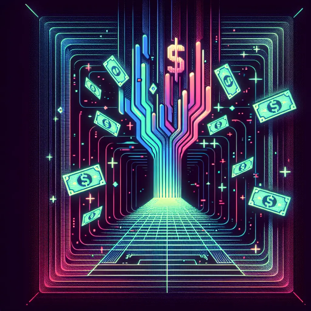

Build a $80,000 One-Page Website: How One Page can Do What a Hundred Couldn’t
The first time I saw my Stripe account leap by $80,000 in just three weeks, I nearly spilled my coffee. It wasn’t magic—it was the power of a single, well-built landing page, miles away from the chaotic, unfocused websites I used to make. Here’s the real story of what made this one-page wonder tick, the messes I made getting there, and why it was worth every experiment (and caffeine jitters).
Landing Pages vs. ‘Regular’ Websites: Why Less Really Is More
Early on, I poured energy into building multi-page websites, expecting sales to follow. Instead, I got plenty of lukewarm traffic and almost no conversions. The real breakthrough came when I focused on High Converting Landing Pages. One single landing page brought in $80,000 in just three weeks—proof that less really can be more.
Landing pages work because they cut out the noise. Visitors make snap decisions, often within seconds, so clarity and relevance are critical. A landing page with a single goal and a focused call to action outperforms a cluttered homepage every time. In fact, research shows that focused CTAs can double conversion rates. As I learned, even the best product will flop if the landing page isn’t effective.
‘If someone doesn’t read this one page website, they definitely will not be using your product…even if you build the best product in the world, if you don’t have a great landing page, no one’s going to buy.’

The Ingredients of a High-Converting Landing Page (And Yes, You Need ALL of Them)
After years of trial and error, I’ve learned that high-converting landing pages rely on three essentials: buyer persona, pain point, and a strong Unique Selling Proposition in marketing. “There are three key principles that if you get right, you will turn this random landing page into high converting sales machine.” First, Buyer Persona Development is not optional. If you try to target everyone, you’ll reach no one. Research shows that tailored content boosts engagement and conversions.
Second, pinpoint your visitor’s pain. If you can’t identify what’s keeping them up at night, your message won’t connect. Third, your USP must stand out—being “just another option” isn’t enough in today’s crowded market. Finally, don’t underestimate Direct Response Marketing Techniques. Persuasive copywriting and clear calls to action are what nudge visitors to act.
Structure Is Everything: My Go-To Landing Page Layout
When it comes to Landing Page Structure Examples, I’ve learned that structure truly makes or breaks results. My go-to layout starts with a strong hero section—your promise in fifty words or less. “The most important thing of any landing page is just the headline… capture people’s attention and to deliver that promise.” Next, the problem section shows visitors you understand their struggles. Then, I highlight the solution or benefit—this is the light at the end of the tunnel.
Don’t leave people guessing; a clear, step-by-step process follows, showing exactly how it works. Social proof comes next, even if it’s just my own credentials (never fake testimonials). I always end with a clear call to action and a helpful FAQ. Research shows High Converting Landing Pages use persuasive copy, simple forms, and design principles that build trust and credibility.

From Blank Canvas to ‘Publish’: Tech Tools, Platforms, and Mild Panic Attacks
Building a landing page used to feel overwhelming, but with the Lovable Website Building Platform, it’s now as simple as typing out a prompt. I started by asking ChatGPT to turn my landing page structure into a starter prompt—“Please turn this full landing page structure into a complete starter prompt to build this landing page in lovable dot dev.” In seconds, Lovable generated a slick, glassmorphic design that nailed my vision. Editing the copy, adjusting the $1,995 price, and tweaking layouts was fast—just remember to save after every change (learned that the hard way). With one click, I published and shared the link instantly. Adding forms for signups with tools like Fillout or Tally was seamless. Research shows using AI tools like ChatGPT and landing page optimization tools can boost efficiency and conversion, especially for AI coding boot camps.
Data, Heatmaps, and the Art of Tweaking Until It Works
I’ll admit it: Microsoft Clarity is my new favorite among landing page optimization tools. “This is a platform called Clarity and it’s probably the only Microsoft product that I love at the moment.” With Clarity, I can watch anonymized visitor behavior—sometimes face-palming at where people click. Heatmaps reveal surprising hotspots: everyone’s hitting the ‘Apply’ button, but some try clicking the ‘About’ text, which tells me what needs fixing.
Tracking application numbers, visitor drop-off, and those mystery ‘rage clicks’ has become part of my routine. Each update, no matter how small, is a mini-experiment. The most important landing page success metrics? Number of visitors and number who act. Everything else follows. Research shows that using tools like Microsoft Clarity for tracking, combined with conversion rate improvement strategies, helps me tune, measure, and repeat—because perfection is always just out of reach.

Faceplants and Eureka Moments: Lessons from My $80,000 Experiment
Landing Page Optimization is a humbling journey. My biggest flop? Trying to please everyone. The real breakthrough came when I focused ruthlessly on a single goal—suddenly, conversions soared. One wild card moment: I A/B tested hero headlines and watched conversion rates jump overnight. Research shows A/B testing and direct user feedback are the best teachers for Conversion Rate Improvement Strategies.
Learning to love the FAQ was another turning point. Answering real objections kept bounce rates low and built trust. I’ve learned that high converting landing pages are never really “done.” Editing after launch, using heatmaps, and tracking mobile-friendliness are all part of ongoing optimization. As I see it, “Anything stopping them from taking that action is something that you can improve on your landing page.” Empathy can’t be outsourced—AI helps, but you must know your crowd.

Conclusion: One Page, Infinite Impact—Why Landing Pages Will Outlive Us All
After years of trial and error, I’ve learned that the real power behind High Converting Landing Pages isn’t flashy code or graphics—it’s understanding your audience and focusing relentlessly on conversions. Building Effective Landing Pages is less about perfection and more about patience, testing, and a willingness to adapt. Think of landing pages like a one-song album: get the single right, and the rest is just filler. Mistakes? They’re not bugs; they’re features that fuel improvement. Every edit, even the smallest, compounds over time. Research shows that knowing your customer always beats chasing the latest design trend. So, if you’re ready, brew something stronger than coffee and put these Landing Page Design Principles to work.
‘Now that you know how to build your own landing page, do it. But if you’re not actually interested in building a landing page, you really wanna be building an app, then I highly recommend you check out this video…’
TL;DR: One focused, customer-driven landing page can out-convert a sprawling website—if you nail the design, copy, and follow-through (and maybe survive a few cold plunges along the way).
Hats off to @wearenocode for the enlightening content! Be sure to take a look here: https://youtu.be/0H15h2ZpRN8?si=B5eyX8gJGcoiP3Ux.
Editor @ Video-Blogger shares expert insights on digital content creation, YouTube strategies, blogging tools, and monetization methods to help creators thrive online. With a keen eye for emerging trends and practical know-how, Editor curates actionable posts that empower readers to turn passion into purpose.
Follow along for tutorials, growth hacks, and the real talk every digital creator needs.